
Chapter 2: The Facade
The silent distance between what we say and what we ship.

By Ryan Stephen, former Director of Design at Sortly, Inc. Background in evolutionary biology, chemistry, and product design. These essays use one company as a specimen to examine what happens when organizations lose the ability to hear the people inside them, how AI is about to make it worse, and why designers might be the only ones left to ask why.
What happens when you open a second browser tab
The first part of this series looked at how to read a company from the outside. You take the name, the colors, and the Glassdoor reviews and see how those artifacts start to form a larger picture. That was about the surface of the organization, but this part is about what’s actually happening behind that facade.
The process is exactly the same as before. Everything here is easy to verify and you don’t need any special insider access to see it. All you really need are two browser tabs for for the marketing site and one for the actual product. In a few cases, you might even swap that product tab for a spreadsheet, since quite a few of the “how-to” articles on the company blog actually end by telling the reader to just export their data and finish the job in Excel.
This information is public and it’s purpose is to establish a cultural baseline.
Anyone can sign up for a free account and explore the product.
Anyone can hit F12, inspect the DOM, and see the lack of a coherent design token system.
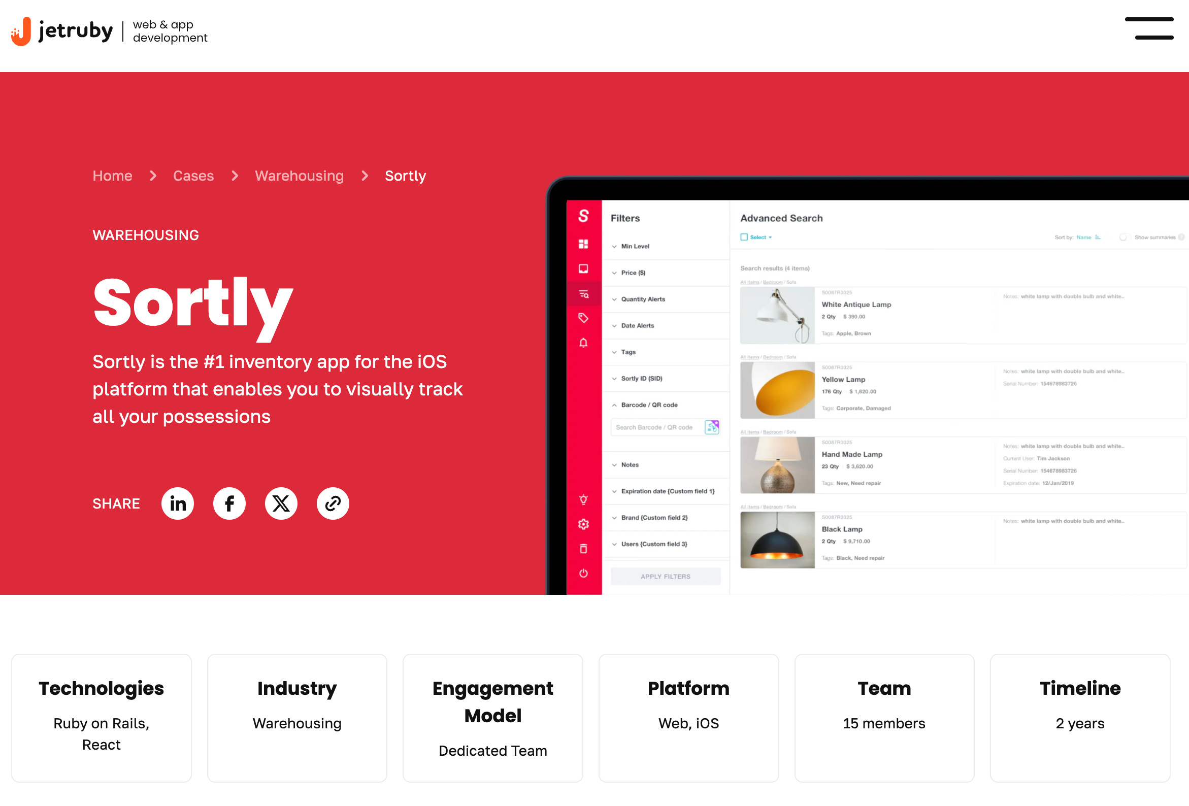
JetRuby published a case study outlining their contributions in detail.
Sortly’s blog posts are public marketing materials.
Google Research: Strategic Analysis of Sortly, Inc.
The Blog and the Spreadsheet
The previous essay flagged the distance between Sortly’s blog and its product. The blog itself is impressive as a content marketing operation, hundreds of articles covering inventory management best practices, industry-specific guides, formulas, frameworks, and how-to walkthroughs. The writing is clear, the SEO is effective, and a small business owner reading the blog would come away feeling like they found a company that really understands inventory management.
The trouble starts when that business owner actually signs up for the product and quickly realizes that while the blog is an expert in inventory management, the software is still catching up.

Take the way the blog teaches you to calculate a Reorder Point. It walks you through a specific formula involving average daily usage, lead times, and safety stock, using clear examples like medical instruments or hardware. It presents this math as an essential practice for any serious business that wants to avoid running out of stock. But when you actually open the product, you just find a single, empty field where you have to manually type in a number. There isn't a calculation engine or any usage tracking working behind the scenes. You end up doing the actual math yourself on a calculator or a scrap of paper, and then you just type "60" into a box and move on.
If you’ve ever audited a product ecosystem and found the marketing site teaching something the product can’t do, you know the moment that follows. The blog is usually careful about how it phrases things. Some articles might mention exporting your data while others skip that part entirely, but the platform definitely positions itself as the home for all your inventory information. The blog moves from “you need this formula” to “start tracking with Sortly” without ever quite saying “Sortly will calculate this for you,” because it won’t. The homepage promises “Inventory Simplified” while the path from the blog’s curriculum to an actual calculation runs through the spreadsheet you were told you’d left behind.
The pattern repeats across the blog’s entire curriculum. EOQ, Safety Stock, ABC Analysis, Bill of Materials, FIFO, LIFO, kitting and bundling. The product has native support for none of them. But the most striking example is demand forecasting. The blog describes it as “essential” for business survival. The company’s LinkedIn campaigns go further, promoting “AI-driven demand forecasting” and “automated replenishment.” When you get into the software, though, you quickly find that it only provides basic historical usage data. All the actual forecasting, the predictive modeling, and the heavy math happen outside the app. You’re forced back into the same spreadsheets the homepage promised you could leave behind. It’s also worth noting that while the ads lean heavily on the "AI" buzzword, you won't find AI mentioned on any of the actual pricing tiers.
It is very common for content marketing to outrun the product it actually supports. Blog teams usually focus on what performs well in search results while product teams are busy building whatever is on the roadmap, and over time, these two parts of the company start to evolve independently. Gustavo Razzetti, a workplace culture consultant, often says that the behavior a company tolerates defines its culture far more than the words written on the walls.
The same logic applies to software. The features that actually ship define the product, not the blog posts that get published. In this case, the gap between what the blog teaches and what the product can actually do is so wide that the only way to bridge them is through a CSV export. And notably, most of the blog articles don’t carry author names, while the founder, who would be the natural face of a company positioning itself as a thought leader in inventory management, doesn’t publish inventory thought leadership regularly on LinkedIn or elsewhere. You end up with hundreds of articles where the authority behind them doesn't seem to belong to anyone in particular.
The Table That Can’t Sort
If you have ever designed or used software that displays data in rows and columns, you likely have an instinct so deeply embedded that it feels almost unconscious. You expect to click a column header and see the data sort itself.
Sortly has a table view that displays your inventory in exactly this way. It looks and behaves like a standard table in most respects, but there is a catch when it comes to custom fields. These are the columns where users store information that the product doesn’t have a native home for, and in this view, they simply can’t be sorted. You click the column header and nothing happens.
Even though the data is right there in front of you, it stays basically inert. You can’t rank it, filter it, or sum it up. There might be some filtering options tucked away in other parts of the software, but where you are looking at your data in rows and columns, the place where sorting belongs, it’s not there.
The product’s own tagline, inventory simplified, translated into the most basic possible feature request.
“As a user, I can sort table columns so that I can understand what is important and meaningful at a glance without having to export to a CSV.”
Custom fields in Sortly function as write-only memory. They are perfectly happy to accept your input and store it faithfully, but they don't actually participate in the logic of the product much. They exist so the product can say “yes, you can track that” without building the infrastructure to make the tracking meaningful. This is useful strategically when users asks for something the product doesn’t natively handle (cost tracking, vendor management, item number, etc.) the answer is “create a custom field.” That answer is technically true, but only in the same way that telling someone they can store water in a colander is technically true. This unsortable table creates a hard boundary where the product’s attention ends and yours has to begin. The moment you actually need to think with your data, you are forced to export a CSV and head back to Excel.
The Folders That Won’t Move
The same principle applies to the folder structure. Sortly lets you organize inventory into folders and subfolders, which is one of the main ways the app helps you stay tidy, but you actually cannot sort those folders yourself.
Think about building a filing cabinet only to have the drawers welded into a fixed order. The user can create any organizational structure they want. You are free to create any organizational structure you want, but you have no say in how that structure is arranged. The very system that promises to finally get you organized has its own opinions about your hierarchy that you are not allowed to override.
While this might seem like a small detail, it reveals a lot about how the team views user agency. The software decides how your folders are ordered while you only get to decide what goes inside them. That philosophy, that the system’s default arrangement takes precedence over the user’s preference, echoes through every layer of the product, and it’s a constraint most people won’t notice the day they have forty different folders and realize they can’t arrange them to find what they need quickly.
The Check-Out That Isn’t
Sortly’s help center describes how to “check out” items, with the quotation marks appearing in the article title itself. The process is straightforward: you scan a barcode and the item moves from one folder to another. It might move from “Available Inventory” to “Out/Jobs,” or from “Warehouse” to “Rented Out.” To return the item, you just move it back. In this system, a check-out is really just a folder move with a more professional name.

Industry-standard check-out systems track who took the item, when they took it, when it’s due back, and what condition it left in. They generate overdue alerts when equipment isn’t returned. They create a chain of custody tied to a person, not a folder. Sortly has some workarounds but there’s no person-assignment field, no due date, no overdue alert, no condition tracking. The activity log records that an item changed folders and when, but reconstructing who has what and for how long means reading timestamps and inferring the rest.
This matters because the Lemoine case study on the company website describes tracking equipment deployment time precisely to help with invoicing. In reality, the product only tracks the folder location of an item. If you want to calculate how long a dehumidifier sat at a particular job site, you have to find the exact moment it moved into the site folder and the moment it moved back, then perform the math yourself. The word "precisely" ends up describing the amount of effort required from the user rather than any actual capability of the software.
The Field That’s Missing
Every contradiction in the product traces back to a single architectural decision that was likely made years ago and never revisited. Sortly has a native Price field, but it does not have a native Cost field.

Price and cost are the two most fundamental numbers for any business handling inventory. Cost is what you paid for the item while price is what you sell it for, and the gap between those two numbers is your margin. Every business that has ever turned a profit understands this distinction, yet a platform used by tens of thousands of businesses has a built-in field for one and completely ignores the other.
The Price field is a fossil. Sortly started as a personal inventory app called “My Things App.” When you’re cataloging your own possessions, you have one number, what the thing is worth. A person doesn’t need to track what they “paid” separately from what something is “worth” because there’s no transaction, no margin, no business logic involved. The Price field made perfect sense for a consumer app, but when the product pivoted to serve businesses, that field survived while a dedicated Cost field never appeared.
This same consumer instinct explains why the product prioritizes photos over SKUs. The core organizational metaphor for Sortly is visual, based on the idea that you take a photo of an object and use that image to find it later. While that is a very intuitive approach for someone cataloging their personal belongings, the actual language of business inventory is built on SKUs. Businesses rely on those unique identifiers to track, reorder, and communicate about their stock. This photo-first philosophy stems from the same original design as the Price field, created for an individual looking at their own things rather than a professional managing a complex catalog.

This missing Cost field creates a ripple effect through every contradiction on the blog. The articles go into detail about Cost of Goods Sold, inventory turnover, ending inventory valuation, and gross margin, along with accounting methods like FIFO and LIFO. Every one of these formulas depends on a specific data point that the product simply does not capture natively. To track cost at all, a user has to create a custom field, which is just a basic text box. It cannot calculate margins against the native Price field, and it has no way to validate that the entry you typed is even a number. Since these custom fields cannot be sorted, the most important number in your entire inventory management system ends up living in an untyped box with absolutely no math behind it.
The Agency That Built the Foundation
Before any of this was built by an internal product team, it was handled by an outside agency. The founder of Sortly originally coded a working prototype on his own, creating a functional app with core features he wrote solo. He found JetRuby, a development agency, by searching for “ruby on rails company” online. In JetRuby’s assessment, he had a product and a clear sense of what it should do, but “no structured business analysis on the identified tasks and goals.” He didn’t have a development plan, a vendor, or a roadmap for how the product should grow beyond its initial features. The engagement ran for years in different phases, one of which included a dedicated team of fifteen people. They were a stable group embedded in the product for the duration, not contractors rotating through. At that time, Sortly actually existed as two separate applications for different types of customers. As the business grew, JetRuby merged them into one, rebuilt the backend from the ground up, and moved everything to a new data model. They designed this structure specifically to let the product scale easily, while also setting up developer onboarding and release management workflows. By the end, JetRuby’s own language is that their engineers “became a core part of Sortly.”
That last line really deserves a second look. Over the course of that entire project, fifteen people from the agency essentially became the core team. They were the ones who designed the backend architecture and chose the data model. They decided which fields would be native and which would be left as basic text boxes, effectively choosing which data types got structure and which did not. The founder, in JetRuby’s own telling, “knew precisely what he wanted to build and what were his business goals” but “had an issue with future aspects, he didn’t know how it should evolve.” So the people making the decisions about how the product would scale and evolve were agency engineers, not inventory management professionals.
Once you know this, the product starts making a different kind of sense for a company that is over a decade old. The Price field without a Cost field, the untyped text boxes, the table that can’t sort. These aren’t oversights by people who understand inventory and chose not to build those features. The infrastructure was built for the company’s original identity, and it has shaped every single layer built on top of it since.

Plenty of successful products started with agency builds. But when the agency engagement is fifteen people deep and two years long, the decisions they make aren’t just scaffolding. They’re the bones. The data model JetRuby chose, the field types they defined, the architectural assumptions they baked into the backend, those became the constraints the company has lived with for the better part of a decade. And if the in-house team that eventually took over didn’t include people who’d actually managed inventory for a living, the foundational assumptions never got challenged. They just got built on top of, layer by layer, until the original scaffolding was buried so deep that replacing it would mean rebuilding the house.
The Vision That’s Not on the Website
The Sortly About Us page is notable for what it lacks. There is no origin story, no founding myth, no vision statement, and no letter from the CEO explaining why the company exists. Instead, the page contains only a single positioning sentence, a few vanity metrics, a breakdown of headcount, and two calls to action. For a business that has operated for over a decade and serves tens of thousands of customers, this total absence of a narrative feels less like a simple oversight and more like a significant gap that has never been filled.

When a company's internal vision and its public story diverge so far that the internal version cannot survive contact with the outside world, that silence becomes diagnostic. It suggests the company might have a sense of what it wants to be but lacks the confidence to say it out loud, or perhaps the vision exists only at a high altitude and hasn't reached the people who actually write the website. Either way, the distance between that internal frame and the public void is a telling detail. You only really notice it when you finish reading the entire page and realize you still haven't learned anything about the actual heart of the organization.
The Front End
This section is for the designers and the engineers in the room. Sortly’s front-end code, which is visible to anyone who opens browser developer tools, shows no evidence of a token system. There are no systematic naming conventions for components and no consistent UI framework tying the interface together. These gaps are observable in the production environment through things like broken keyboard navigation, inconsistent focus states, and side drawers that pop out on top of tables.

Whether a design system exists in Figma is something only employees would know, but whatever internal design infrastructure exists is not surviving the journey from design to code. No shared language is making it through the handoff. The effect remains the same whether the design system does not exist or simply isn’t being enforced, because the shipped product does not reflect one.
For a product that markets itself specifically to enterprise and government customers, and even maintains dedicated industry pages for both, these technical gaps matter more than they might seem. Government contracts in the United States often require Section 508 accessibility compliance. Based on the current state of the production front end, the software would likely have a difficult time passing that specific audit. For a sophisticated enterprise or government buyer, discovering that kind of gap can end a software evaluation before it even reaches the demo stage.
What Facades Are Made Of
The facade at Sortly is well-constructed. The blog is genuinely educational, the brand feels warm, and the product serves its purpose for basic inventory tracking. For its core audience, the software does exactly what it promises. These are real assets that real people built with genuine care.
However, the blog teaches a curriculum that the product cannot actually administer, and the table displays data that it cannot sort. Custom fields are happy to accept input that they have no way to process. The front end ships without the kind of systematic infrastructure that enterprise buyers look for during an evaluation. Even the vision that might tie these pieces together, the story explaining the company's origin and its future, is missing from the public eye.

This facade holds together because the typical customer, often an overwhelmed small business owner just getting started, does not immediately notice where the depth runs out. They find the blog, learn something useful, sign up, and feel a sense of relief as they organize their inventory into folders and photos. The product works for them until the moment they grow. It works until they actually need those formulas from the blog, or they try to sort a column that will not move, or they find themselves exporting a CSV to open the very same spreadsheet the homepage told them they could leave behind.
But the customer isn’t the only one who walks around to the side of the building. The people who maintain the facade from the inside also know exactly where the depth runs out.

A designer stares at that unsortable table every single sprint. An engineer ships new components without a shared language to name them. Someone on the support team fields a question the product cannot answer and writes a workaround they have already written a dozen times before. Each of these people carries the weight of the distance between what the marketing site promises and what the product actually does.
None of this is unusual, and most of it is just how marketing works everywhere, which may be why it goes unspoken for so long that people eventually stop noticing they are even carrying it.
This essay is part of a series on design, communication, and the future of work. f you want to support this project given the legal risk, you can contribute to the 451 Firewall Fund. Read the full collection on Substack and Medium. The companion project lives at helloyouexperiment.com.